
Your UI is Ugly. There, I Said It. 💔 (And It's Killing Your Retention)
- Primal Cam
- Jul 18, 2025
- 4 min read


Let's be blunt: your Roblox game could be a masterpiece of scripting and world-building, but if its User Interface (UI) is a hot mess, you're actively driving players away. I see it constantly: amazing concepts hidden behind cluttered menus, unreadable text, and buttons that make no sense.
Think about it. The moment a player joins your game, their eyes are scanning your UI. Is it inviting? Is it intuitive? Or does it scream, "I was made in 5 minutes with default Roblox elements and zero thought"?
I'm Primal Cam, and I'm not here to sugarcoat it. Ugly, confusing UI is an invisible killer, silently destroying your game's retention and pushing it further from the Front Page. But here's the good news: fixing it is often simpler than you think. It's about understanding a few core principles that top Roblox games master, and I'm going to break them down for you.
The UI/UX Death Trap: Why Players Leave in Seconds 💀
User Interface (UI) is what players see (buttons, text, menus). User Experience (UX) is how they feel when using it (is it easy? Frustrating? Fun?). They are inseparable.
When your UI/UX is bad:
Instant Frustration: Players don't know what to click, where to go, or how to play. They get annoyed.
High Churn Rate: A frustrated player is a departing player. They leave within seconds or minutes.
Reduced Session Time: If they can't figure out basic mechanics, they won't stick around.
Algorithm Rejection: Low retention and session times tell Roblox your game isn't engaging, pushing it down the ranks.
Lost Monetization: If they can't find your shop or understand how to buy things, you lose Robux.
This isn't about being a professional graphic designer. It's about empathy for your player and designing for clarity, efficiency, and delight.

The 7 Deadly Sins of Roblox UI (and How Top Games Avoid Them) 🔥
Let's dissect the common mistakes that plague Roblox UIs and see how successful games flip the script.
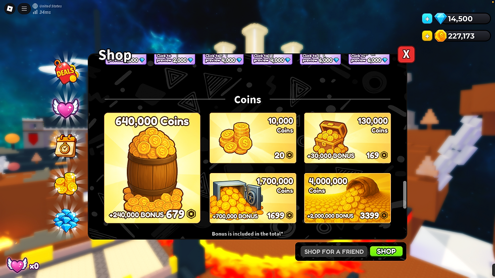
1. The Cluttered Screen Syndrome 🗑️
Sin: Jamming every single button, stat, and icon onto the screen all at once. It's overwhelming and makes the game look messy.
How Top Games Fix It:
Prioritize ruthlessly: What's essential? What can be hidden in a menu?
Progressive disclosure: Reveal UI elements as the player unlocks them or as they become relevant.
Clean layouts: Use grids, clear spacing, and alignment to organize elements.
EXAMPLE: Many successful RPGs start with minimal UI, then slowly introduce complex inventory or skill menus as the player progresses.
2. Unreadable Text (Tiny, Weird Fonts, No Contrast) 👓
Sin: Using fancy, thin, or tiny fonts; putting light text on light backgrounds (or vice-versa); not using outlines or shadows.
How Top Games Fix It:
Legible Fonts: Stick to clear, bold, sans-serif fonts for most UI text.
Strong Contrast: Ensure text always has high contrast with its background. Black on white, white on dark, or use outlines/shadows.
Appropriate Sizing: Text must be readable on mobile phones. Test it!
EXAMPLE: Bloxburg uses clear, readable fonts with good contrast for all its essential UI elements, ensuring players can always understand their options.
3. Inconsistent Styling & Branding 🎨
Sin: Different button styles, clashing colors, mixed font types, or a UI that looks nothing like your game's actual aesthetic.
How Top Games Fix It:
Define a Style Guide: Even informal, pick 2-3 main colors, 1-2 fonts, and a consistent button shape/style.
Cohesive Visuals: Ensure your UI's look and feel match your game's theme (e.g., sci-fi UI for a space game, medieval UI for a fantasy game).
EXAMPLE: Adopt Me! maintains a soft, friendly, and consistent visual style across all its UI, mirroring its wholesome gameplay.
4. Confusing Button Icons & Lack of Labels ❓
Sin: Using obscure icons without any text label, or icons that don't clearly represent their function.
How Top Games Fix It:
Clear Icons + Text: Wherever possible, use both a clear, recognizable icon and a short text label.
Standard Icons: Use universally understood symbols (e.g., a gear for settings, a shopping cart for a shop).
Tooltips: Implement hover-over tooltips for complex icons or buttons to provide extra context.
EXAMPLE: Jailbreak uses easily identifiable icons for its vehicle spawns, inventory, and interactions, often paired with text.
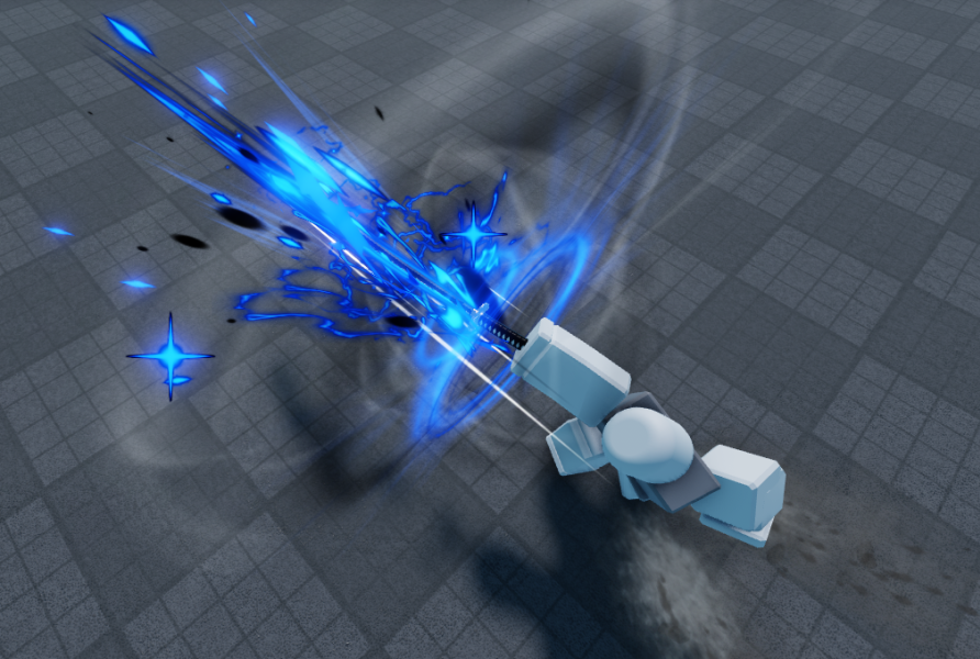
5. No Visual Feedback for Player Actions 🚫
Sin: A player clicks a button, and nothing happens. Or they interact with something, and there's no visual/auditory confirmation.
How Top Games Fix It:
Button States: Buttons should change color/scale on hover and click.
Loading Indicators: Use spinners or progress bars for longer operations.
Sound Effects: A satisfying "click," "ding," or "whoosh" confirms actions.
Pop-ups/Notifications: Confirm purchases, quest completions, or level-ups with clear, non-intrusive messages.
EXAMPLE: When you collect coins in Pet Simulator X, the satisfying sounds and visual indicators (numbers flying up) provide instant, positive feedback.
6. Ignoring Mobile User Experience (UX) 📱
Sin: Designing for PC only, leading to tiny buttons, reliance on keyboard shortcuts, or UI elements blocking screen view on mobile.
How Top Games Fix It:
Thumb-Friendly Buttons: Ensure buttons are large enough to be easily tapped with a thumb.
Minimalist Mobile UI: Often, mobile UIs need to be even more simplified due to screen real estate.
Touch Input Optimization: Test extensively with touch to ensure smooth interactions.
EXAMPLE: Many successful mobile-first Roblox games (like obbies or simulators) have large, clearly spaced buttons for movement and interaction.
7. Pop-Up Spam & Intrusive Ads 🛑
Sin: Blasting players with multiple, unavoidable pop-ups for game passes, daily rewards, and tutorials the moment they join.
How Top Games Fix It:
Strategic Timing: Show pop-ups only when relevant (e.g., shop on opening shop UI, daily reward on first login).
Clear "X" to Close: Always give players an easy way out.
Value-Driven Pop-ups: Ensure pop-ups provide clear value or an exciting offer, not just nagging.
EXAMPLE: Doors uses a simple, non-intrusive main menu before you enter a game, allowing players to choose their experience without being overwhelmed.
Your Path to UI/UX Mastery: From Confusion to Conversion 🌟
Your game's UI is its face. Make it welcoming, intuitive, and visually appealing. By focusing on clarity, consistency, and player feedback, you can transform your UI from a retention killer into a powerful tool for engagement. This isn't just about making things look good; it's about making them feel good to use, which directly translates to more time spent in your game and higher visibility on the Front Page.
Stop letting bad UI sabotage your game's potential. Start designing for your players' experience, and watch your retention numbers soar.

$50
Product Title
Product Details goes here with the simple product description and more information can be seen by clicking the see more button. Product Details goes here with the simple product description and more information can be seen by clicking the see more button

$50
Product Title
Product Details goes here with the simple product description and more information can be seen by clicking the see more button. Product Details goes here with the simple product description and more information can be seen by clicking the see more button.
$50
Product Title
Product Details goes here with the simple product description and more information can be seen by clicking the see more button. Product Details goes here with the simple product description and more information can be seen by clicking the see more button.

Comments