
Beyond Clickbait: Designing Roblox Thumbnails That Convert Players (Not Just Clicks!) 🖼️
- Primal Cam
- Jul 15, 2025
- 4 min read


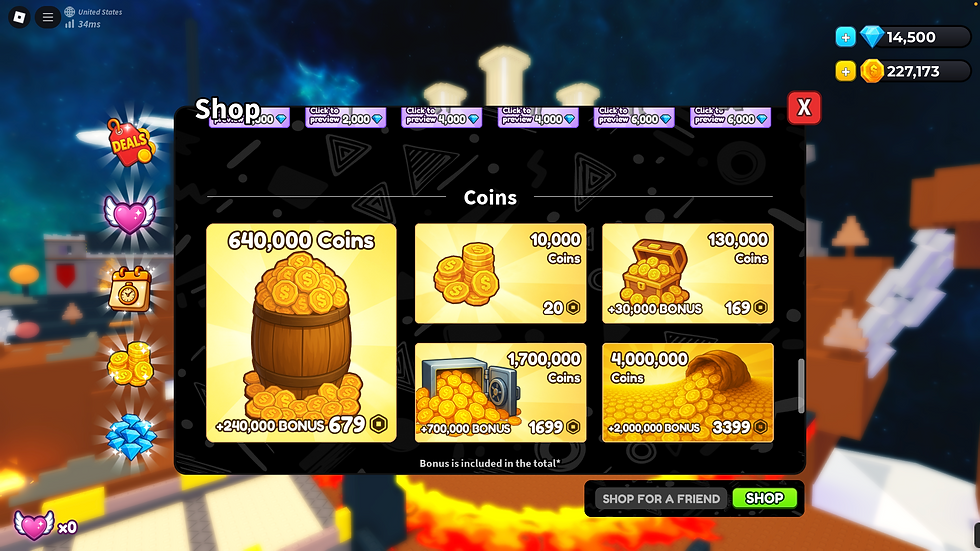
You’ve poured your soul into building an incredible Roblox game. The mechanics are flawless, the world is stunning, and the code is cleaner than a freshly wiped whiteboard. But then... crickets. Your game sits there, ignored on the vast Discover page, while generic simulators rack up millions of visits.
What gives? The harsh truth is: your game isn't judged by its gameplay first. It's judged by its thumbnail and icon. And if those don't scream "PLAY ME NOW!", your masterpiece might as well be invisible.
I'm Primal Cam, and I'm here to tell you that getting clicks isn't enough. Anyone can make a clickbait thumbnail, but the real secret to Front Page success is designing visuals that don't just get players to click, but to stay. This is about converting impressions into engaged players, which is exactly what the Roblox algorithm craves.
The Harsh Reality: Your Thumbnail is Your Game's First (and Often Only) Impression
Imagine a crowded store aisle. Hundreds of products are screaming for attention. Which one do you grab? The one with the clear, appealing, and relevant packaging. Your Roblox game is no different.
Players on Roblox's Discover page scroll at lightning speed. You have less than one second to:
Grab attention: Stand out from the visual noise.
Communicate value: Instantly convey what your game is about.
Spark curiosity: Make them want to know more.
If your thumbnail fails at any of these, they're gone. And every lost potential player means less playtime, lower retention, and a colder shoulder from the Roblox algorithm. This isn't just about aesthetics; it's about marketing psychology applied directly to your game's discoverability.
The Anatomy of a Winning Roblox Thumbnail: From Blurry Mess to Viral Magnet
Forget generic screenshots or slapping your game's title on a gradient. Top Roblox games use calculated design principles to ensure their thumbnails are irresistible.
1. Clarity is King (Especially on Mobile) 👑
Your thumbnail will be displayed tiny on mobile screens. If it's cluttered, too dark, or has microscopic text, it's immediately ineffective.
HACK: Simplify your composition. Focus on one main subject (character, action, key game feature).
TIP: Test for legibility. Shrink your thumbnail down to a 100x100 pixel size. Can you still tell what's happening? Is any text readable? If not, simplify.
HOW TO: Use high contrast. Bright elements on dark backgrounds (or vice-versa) pop. Avoid colors that blend into the Roblox UI.
2. Emotion Sells (Show, Don't Just Tell) 🎭
Players are looking for an experience, an emotion. Does your thumbnail convey: excitement? Challenge? Relaxation? Fun?
TRICK: Show a character experiencing that emotion. A player laughing, a character fighting, a group collaborating.
HACK: Focus on dynamic action. A character running/jumping/fighting is more engaging than a static pose. Show a moment of peak gameplay.
DID YOU KNOW: Humans are hardwired to react to faces. A clear, expressive character face (even Robloxian) can draw the eye.
3. Tell a Story (or Hint at One) 📖
A good thumbnail isn't just a picture; it's a window into your game's world.
TIP: Highlight your unique selling proposition (USP). What makes your game different? Is it a unique pet? A never-before-seen vehicle? Show it!
HOW TO: Showcase core gameplay. If it's a combat game, show action. If it's a building game, show an impressive build.
HACK: Use environmental storytelling. A dark, spooky forest implies horror. A bustling city implies role-play.
4. Color Psychology & Vibrancy 🌈
Roblox is a vibrant platform. Your thumbnail needs to match that energy while still standing out.
TIP: Go for vibrant, saturated colors. They catch the eye more effectively than muted tones.
TRICK: Use complementary colors. Colors opposite each other on the color wheel (e.g., blue and orange, red and green) create strong visual contrast that pops.
DID YOU KNOW: Bright, warm colors (reds, yellows, oranges) tend to evoke excitement and urgency, while cool colors (blues, greens) can convey calm or mystery.
5. Strategic Text Placement & Readability ✏️
While visuals are primary, text can reinforce your message – if used correctly.
HACK: Keep text minimal. A few impactful words are better than a wall of text.
TIP: Use bold, legible fonts. Avoid thin, script, or overly decorative fonts that are hard to read at small sizes.
HOW TO: Position text away from edges and metadata. Roblox overlays player counts and other info, so keep your crucial text in the center-top.
TRICK: Use outlines or drop shadows to make text stand out against busy backgrounds.
6. Consistency is Key (Branding Matters) 🤝
Your game icon and thumbnail should feel like they belong to the same experience. This builds trust and recognition.
TIP: Maintain a consistent style, color palette, and character design across your icon, thumbnails, and in-game UI.
HACK: Develop a "thumbnail template" or style guide for your game to ensure all your promotional images have a cohesive look.
Beyond Design: The "A/B Test" Mindset (Even Without Official Tools)
Roblox does offer A/B testing for thumbnails to some developers, but even if you don't have access, you can adopt an A/B testing mindset.
Create Variations: Design 2-3 significantly different thumbnails for your game. Don't just change a color; try different characters, actions, or themes.
Observe Analytics: Manually switch your thumbnail every few days or a week. Monitor your "Qualified Play-Through Rate (qPTR)" and "Average Session Time" in your Creator Analytics.
Learn & Iterate: Which thumbnail led to higher session times? Which one had a better play rate? Learn from the data, refine, and repeat. Don't just chase clicks; chase engaged plays.
Remember, Roblox's system aims to show the most relevant thumbnail to each user, and it learns over time. Providing diverse, high-quality options helps the system work for you.
Your Next Step: From Creator to Conversion Master
Your game deserves to be seen, played, and loved. But that starts with a thumbnail and icon that truly represent its potential and speak directly to your target players. Stop blending in and start standing out with visuals that convert.
Ready to transform your game's first impression and unlock its true potential for millions of visits?
🚀 Dive deeper into game design, visual excellence, and marketing strategies on my website now:
For more tips on how to make your Roblox game visually appealing, check out this video on How to Make Eye-Catching ROBLOX Game Icons.

$50
Product Title
Product Details goes here with the simple product description and more information can be seen by clicking the see more button. Product Details goes here with the simple product description and more information can be seen by clicking the see more button

$50
Product Title
Product Details goes here with the simple product description and more information can be seen by clicking the see more button. Product Details goes here with the simple product description and more information can be seen by clicking the see more button.
$50
Product Title
Product Details goes here with the simple product description and more information can be seen by clicking the see more button. Product Details goes here with the simple product description and more information can be seen by clicking the see more button.

Comments